Crocker Art Museum Refresh
Brand Identity / Design System / Logo Design
The Crocker Art Museum has always been a place where history, creativity, and community meet, and I wanted to create a self-initiated brand refresh that reflects that feeling in a modern, welcoming way. My vision was to build an identity system that enhances the museum experience while keeping the spotlight on the art itself.
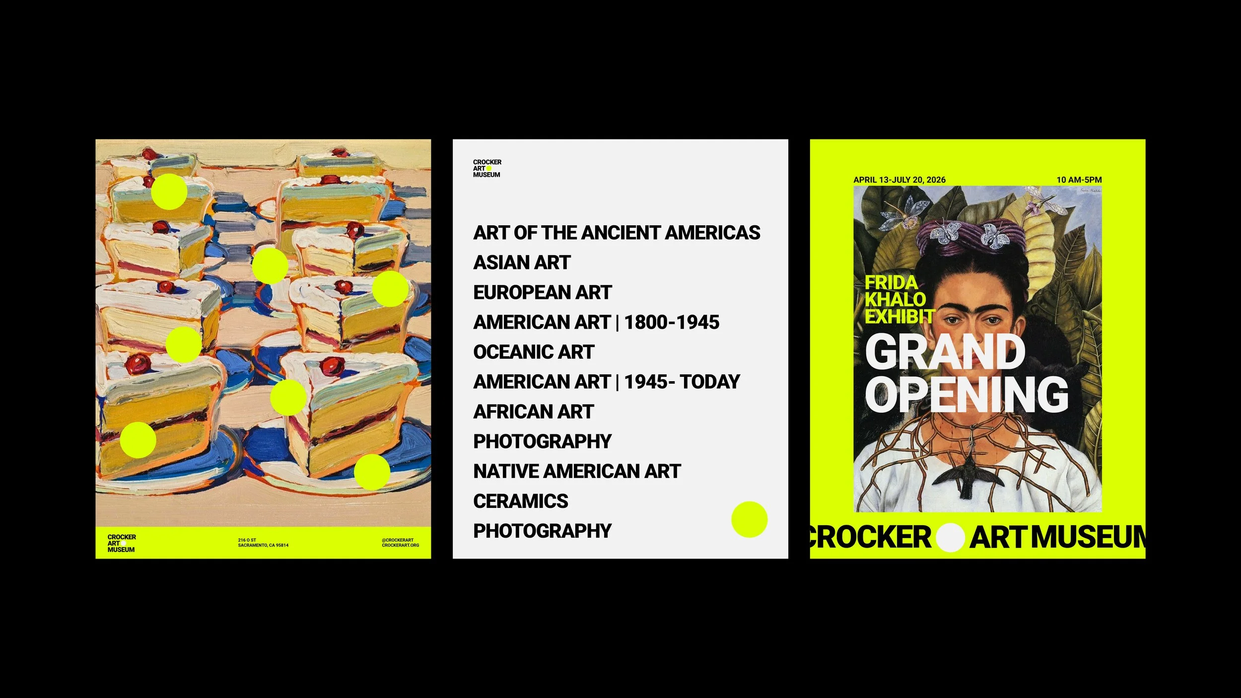
The branding is intentionally simple and understated. I focused on clean typography, gentle spacing, and a palette that feels warm and approachable. Everything is designed to support the artwork, not compete with it, creating a calm visual foundation that lets each piece shine.
A key element of the system is a series of circular forms. These circles represent a viewfinder, echoing the way visitors naturally observe and explore the galleries. They symbolize focus, curiosity, and the personal lens each viewer brings to the museum.
I carried the project from initial research through creative direction, identity design, illustration, and layout development. The result is a refined and flexible visual language that feels fresh, thoughtful, and rooted in the experience of seeing art up close.
This refresh is my interpretation of how the Crocker can continue inspiring visitors, inviting them to look deeper and discover something new every time they walk in.