Crocker Art Museum Refresh
Brand Identity / Design System / Logo Design
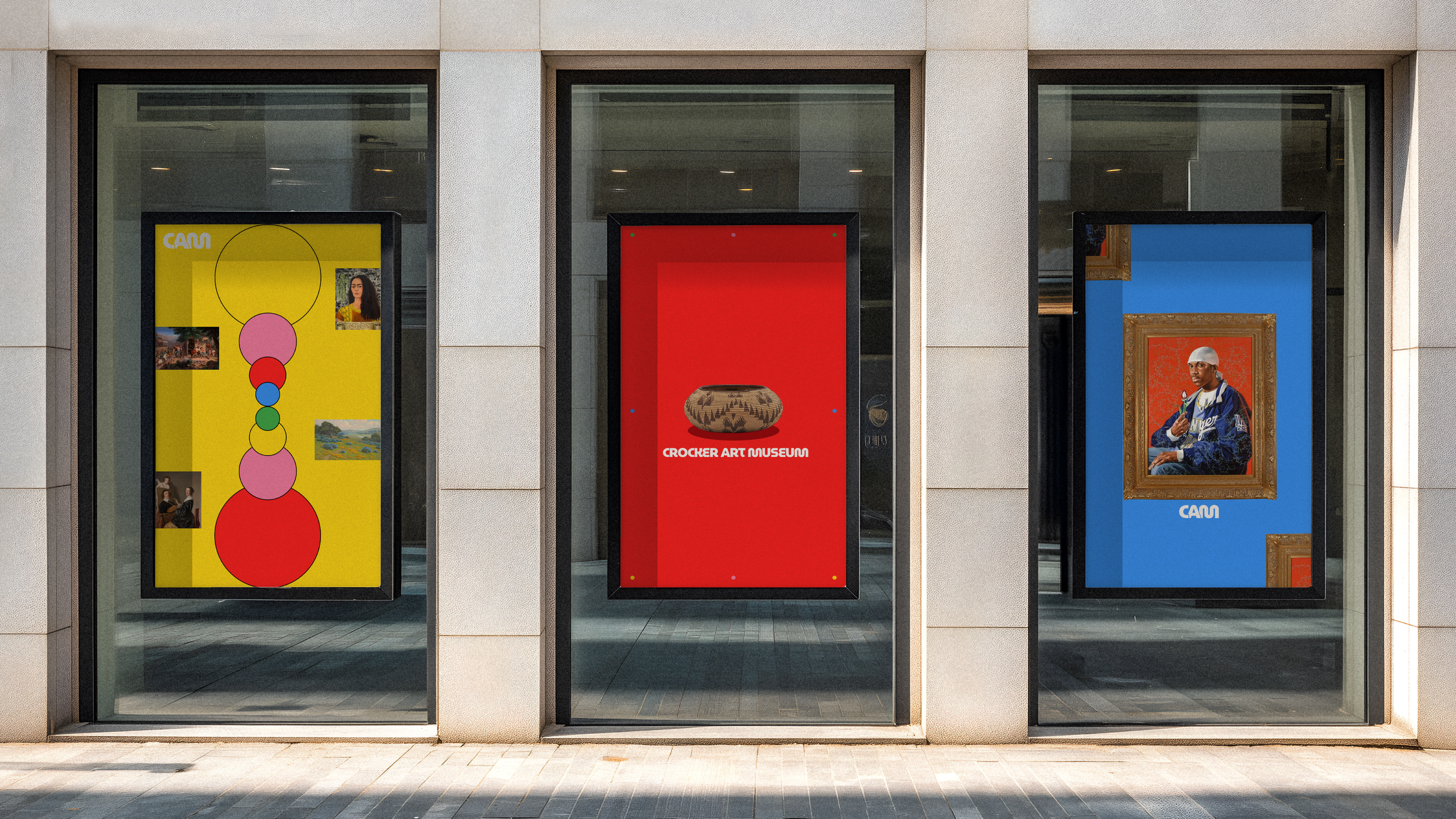
As the oldest art museum west of the Mississippi, the Crocker Art Museum holds a deep cultural legacy while continuing to evolve alongside the city it calls home. This self-initiated brand refresh is my fun, colorful take on how a historic institution can feel playful, current, and full of personality without taking away from the art it showcases.
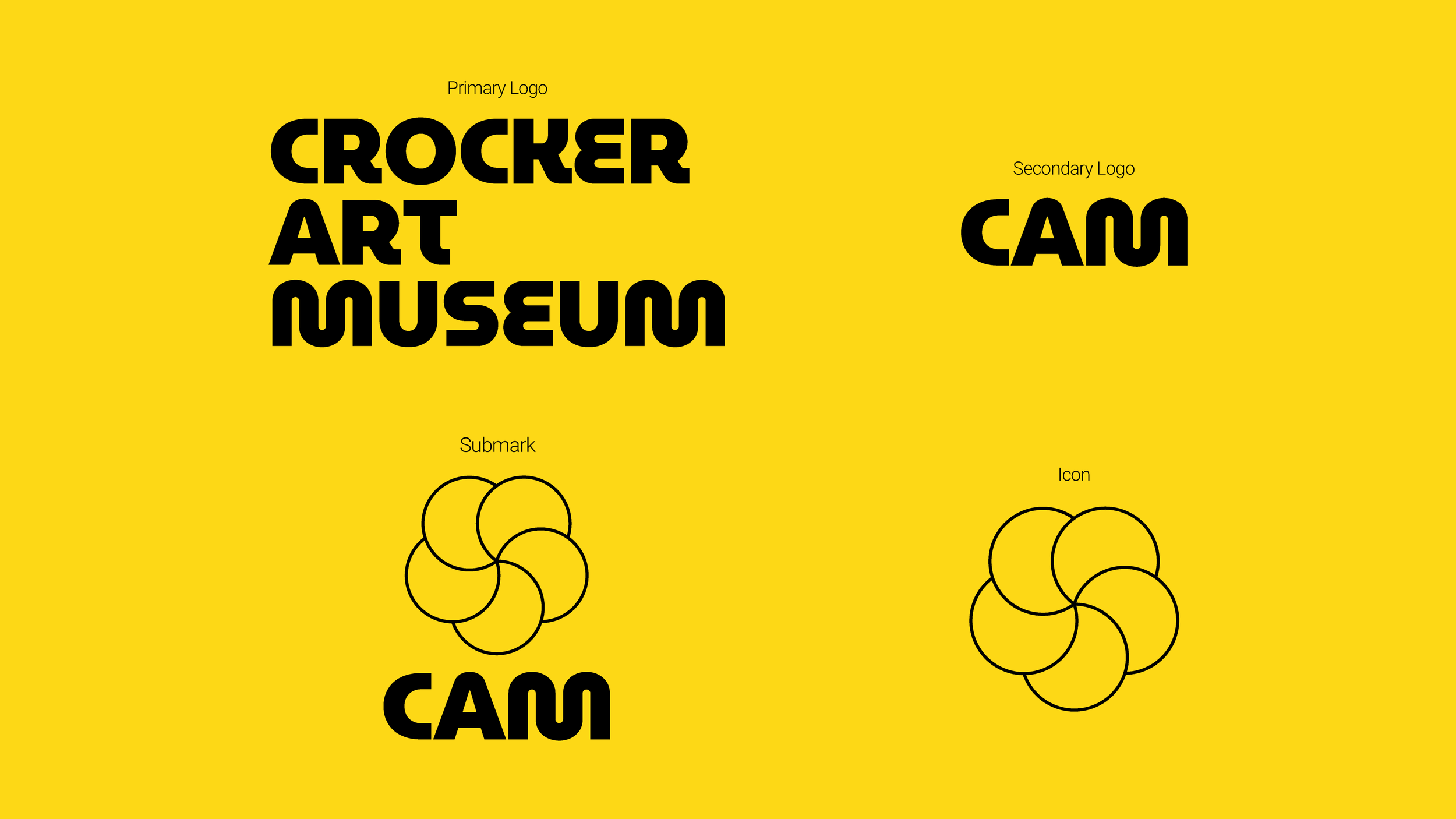
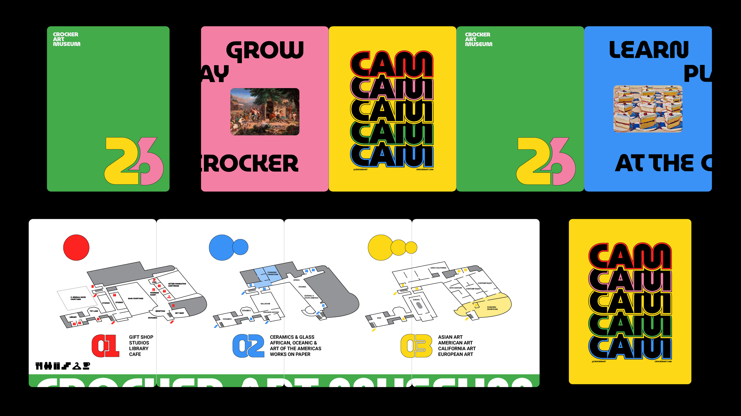
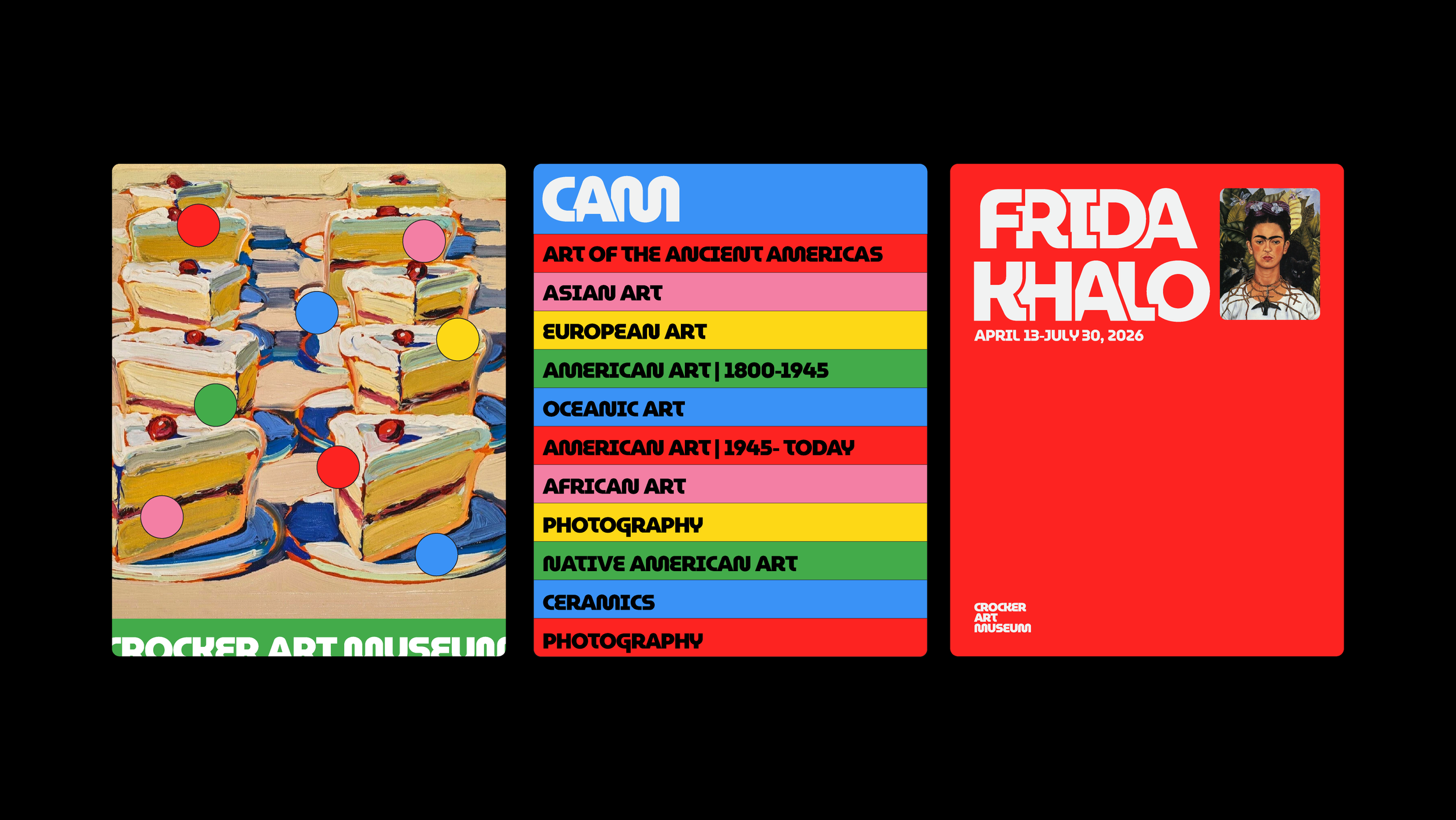
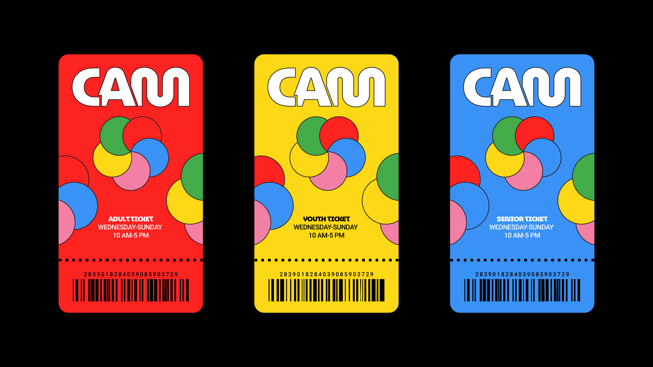
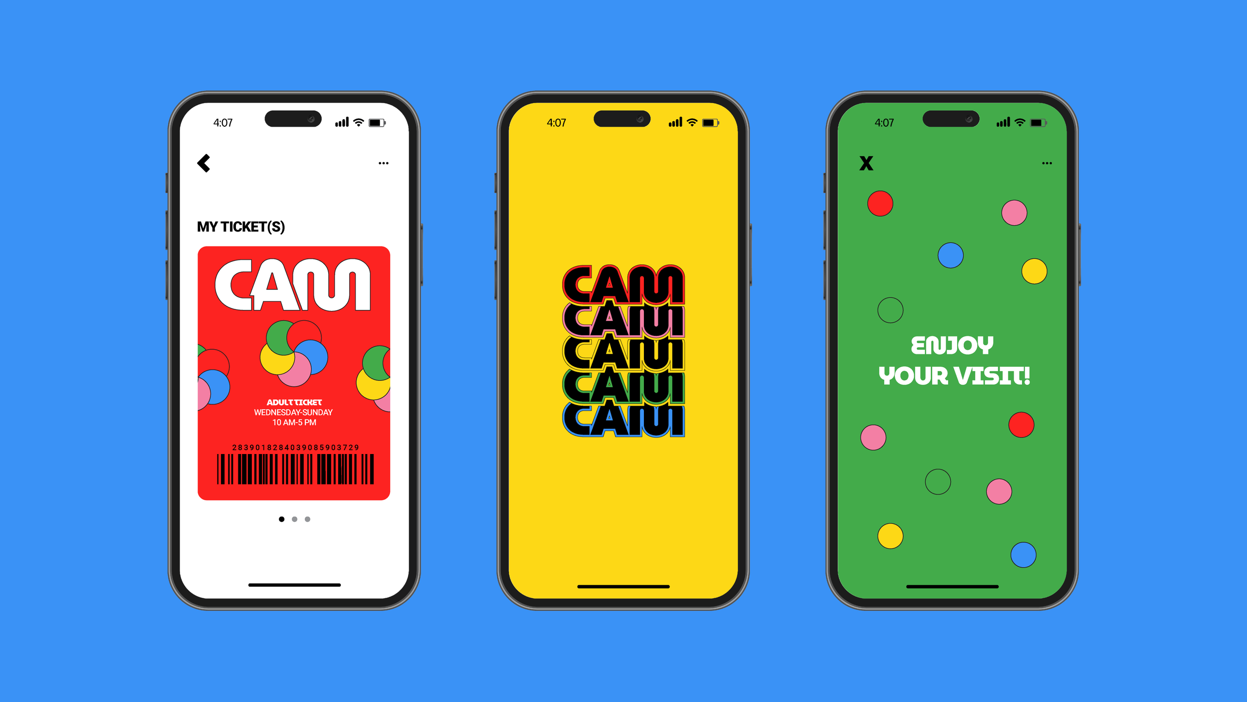
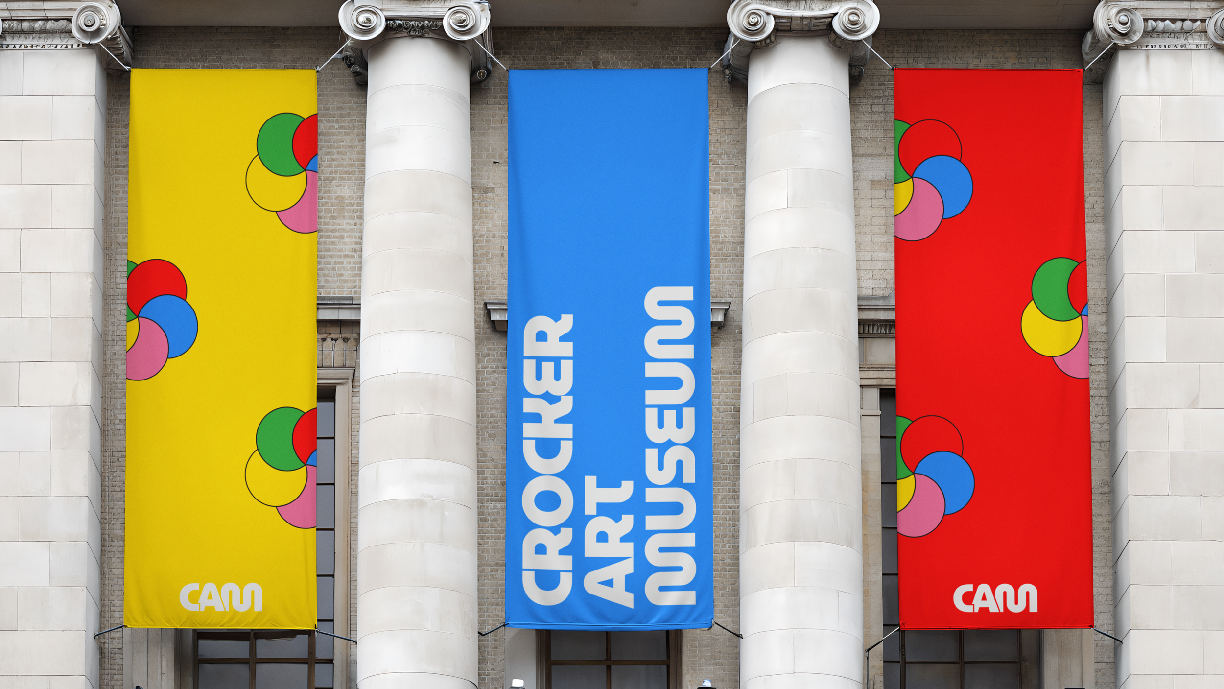
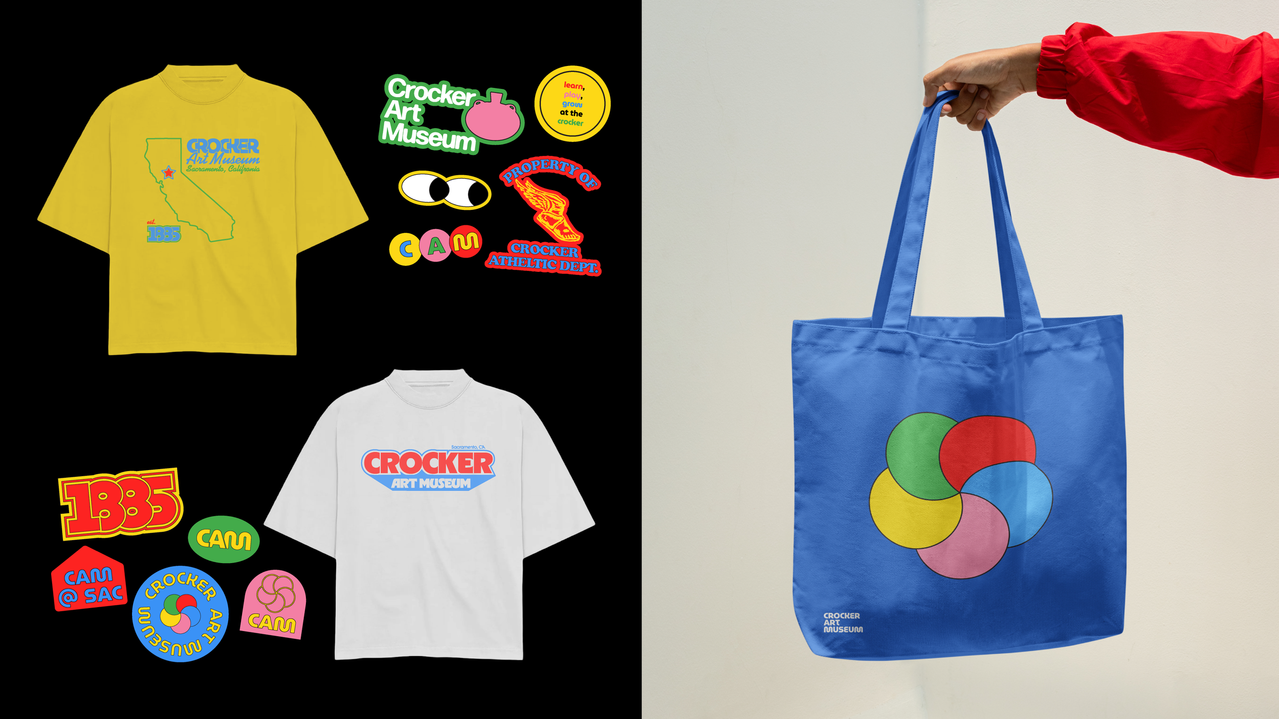
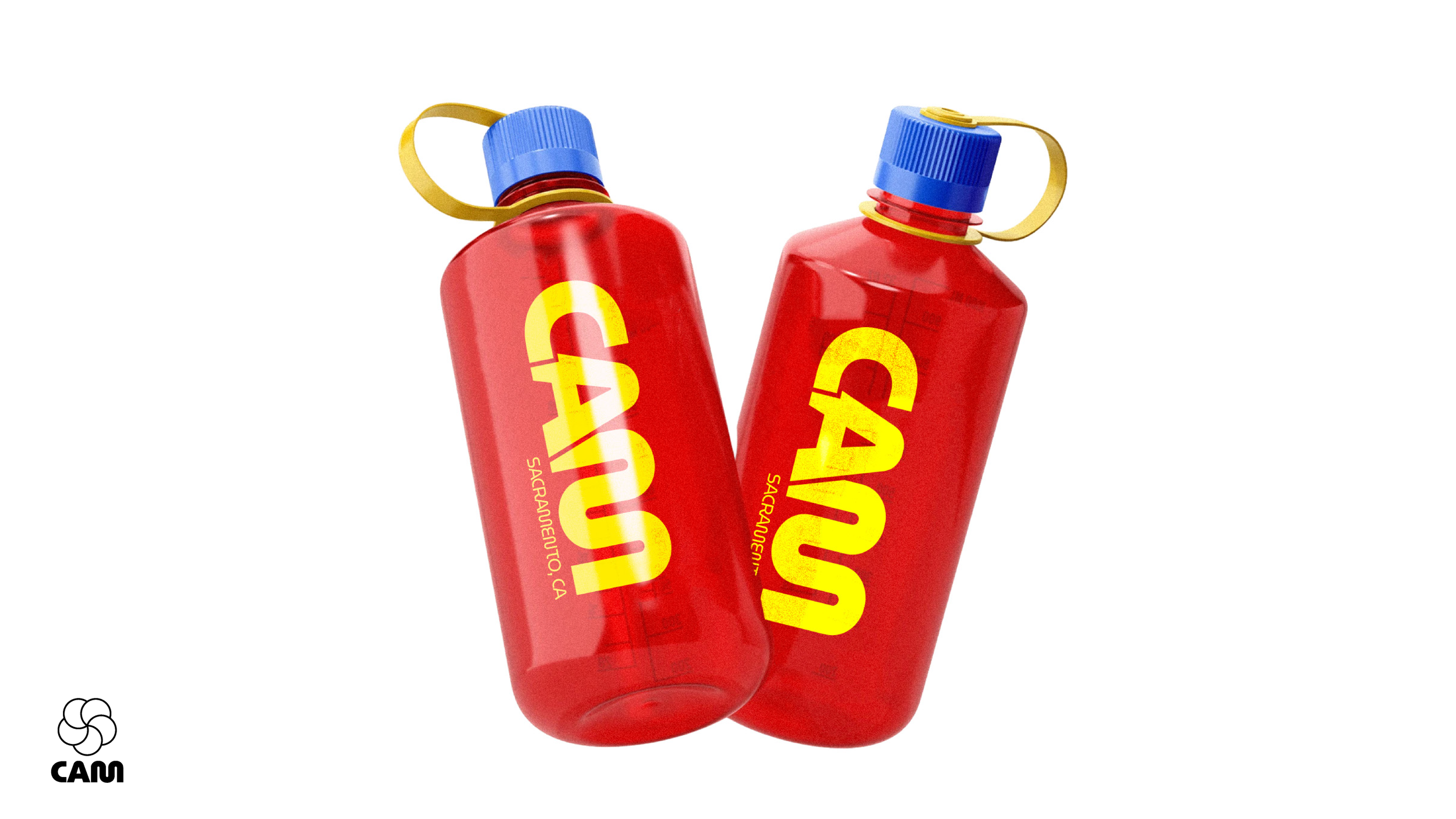
The identity embraces bold primary colors and a rounded, funky typeface for the logo, creating a visual language that feels welcoming, expressive, and timeless. The system is designed to bring energy into the museum’s presence while still allowing the artwork to remain the focal point.
At the center of the brand is a custom mark inspired by the Crocker’s location on O Street and the idea that art moves in cycles. Styles, movements, and trends are always coming back around, and the circular forms reflect that rhythm while also referencing the way visitors view and experience art through their own lens.
In addition to the visual identity, I created a logo animation recorded directly off a CRT television, adding an extra layer of texture and nostalgia. The analog process introduces warmth and imperfection, reinforcing the idea that art and design are living, evolving experiences.
I led the project from research through creative direction, identity design, typography, animation, and system development. The result is a vibrant, flexible brand that honors the Crocker’s history while celebrating creativity in a way that feels joyful, approachable, and alive.